
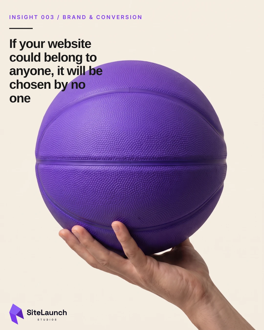
If your website could belong to anyone, it will be chosen by no one.
Brand is not the decoration on top of a website. It is the system that lets a visitor recognize you, remember you, and tell you apart from the four other tabs they have open.
A visitor comparing three businesses in your category does not study your website. They skim it, close it, and open the next one. Twenty minutes later they go back to whichever one they can still picture.
That is the whole problem with a generic site. It is not that it looks bad. Most of them look fine. It is that it looks like everyone else, so there is nothing left in memory to return to. A site that could belong to any business in the category gets chosen the way a coin flip gets chosen.
Recognition is not vanity. It is the thing that lets a visitor find their way back to you.
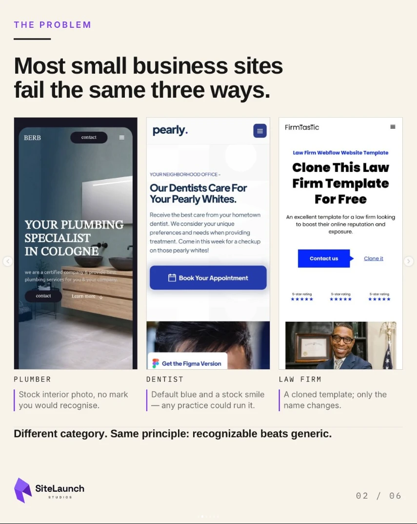
Most small business sites fail the same three ways
A plumber uses a stock interior photograph with no mark anyone would recognize. A dentist runs default blue and a stock smile, exactly as half the practices in the city do. A law firm clones a template and changes only the name.
Three different categories, three different budgets, and the same outcome. Nothing on any of those pages is wrong. Nothing on any of them is theirs either.
What brand actually does
- 01RecognizeThe visitor knows whose site they are on, without checking the logo.
- 02RememberDistinctive visual signals create recall after the tab is closed.
- 03TrustConsistency makes the business feel intentional rather than improvised.
- 04ChooseClear positioning makes comparison easier, which is when decisions get made.
Read that list again and notice what is missing. None of it is about taste. Brand here is not a mood, a logo refresh or a color you happen to like. It is a recognition system: a small set of signals, repeated often enough that a stranger starts to associate them with you specifically.
Which is also why consistency does more work than creativity. A moderately interesting palette used the same way on every page will outperform a brilliant one used once.
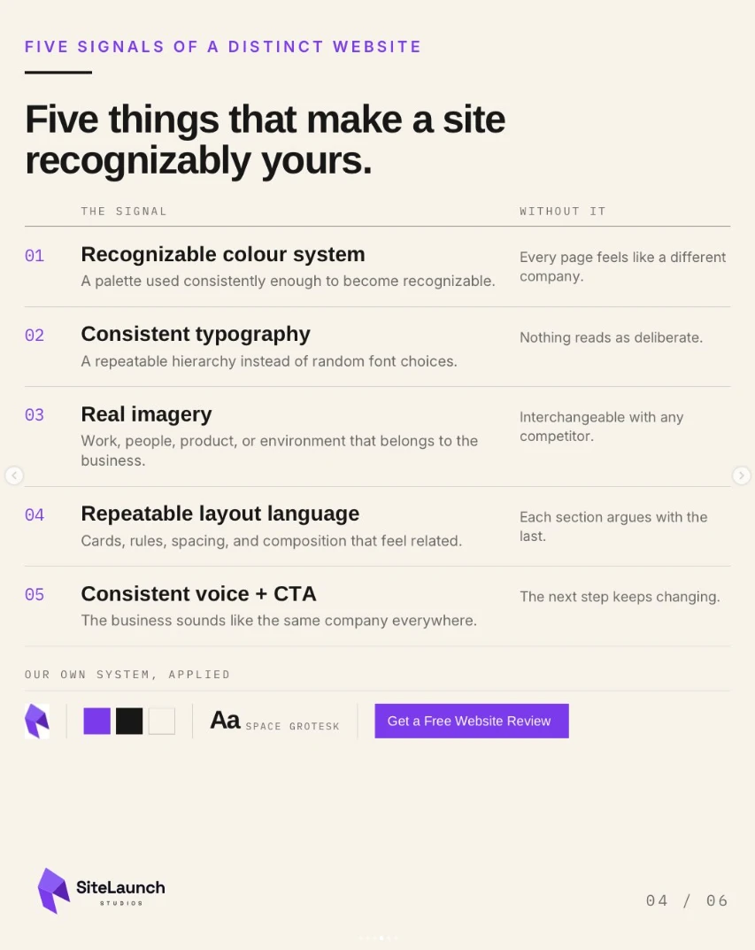
Five things that make a site recognizably yours
- 01Color systemA palette used consistently enough to become recognizable. Without it, every page feels like a different company.
- 02TypographyA repeatable hierarchy instead of random font choices. Without it, nothing reads as deliberate.
- 03Real imageryWork, people, product or environment that belongs to the business. Without it, you are interchangeable with any competitor.
- 04Layout languageCards, rules, spacing and composition that feel related. Without it, each section argues with the last.
- 05Voice and calls to actionThe business sounds like the same company everywhere. Without it, the next step keeps changing.
Of the five, real imagery is usually the fastest to fix and the one most often skipped. Stock photography is the single clearest signal that a website is describing a category rather than a business. The moment a visitor sees your actual van, your actual counter, your actual team, the page stops being generic, whatever else is still unfinished.
Same category. Different memory.
| Generic | Distinct |
|---|---|
| Random palette | Recognizable palette |
| Stock imagery | Imagery that belongs to the business |
| Vague copy | Specific language |
| Inconsistent typography | Repeatable type system |
| Generic call to action | One clear next step |
The left column could belong to anyone. The right column feels like one business, which is the entire difference.
Distinct does not mean louder. It means more recognizable.
This is where most rebrands go wrong. Distinct gets read as bold, so the fix becomes a brighter color and a bigger headline, and the site ends up shouting the same generic sentence. Volume is not recognition.
Recognition comes from repetition and restraint. Fewer colors, used the same way. One type hierarchy, applied everywhere. Your own photographs, even the imperfect ones. The same next step on every page, worded the same way.
A brand recognition audit you can run today
Open your site on a phone, then open two competitors in separate tabs. Work down the list honestly.
- Cover the logo on your homepage. Is there anything left that identifies the business?
- Count the colors doing real work across three pages. More than three or four usually means none of them are memorable.
- Check whether headings use the same hierarchy on every page, or whether sizes were chosen per page.
- Count how many images are stock. Any that could appear on a competitor's site are not working for you.
- Read the call to action on three different pages. Is it the same words, or three different invitations?
- Ask someone who has not seen the site to describe it an hour later. What they recall is what is actually distinctive.
- Put your homepage beside a competitor's and ask which one a stranger would be able to name tomorrow.
You are not looking for the site to be exciting. You are looking for it to be identifiable, which is a much lower and far more useful bar.
Common questions
- Does a small business need a full brand system?
- No. Most small businesses need a working one, not a complete one. A defined palette, one type hierarchy, a rule for imagery and a consistent call to action will carry an entire website. Full identity work, naming and positioning are separate projects, and a site can become recognizable long before any of that happens.
- Which brand elements affect website trust?
- Consistency affects it most. When color, type, spacing and tone stay the same from page to page, the business reads as deliberate and established. Real photography of your own work and people matters just as much, because stock imagery signals that the page is describing a category rather than a specific business.
- Can a website template still feel distinctive?
- Yes, as long as the parts a visitor actually notices are yours. A template controls layout, and layout is rarely what makes a site recognizable. Replace the stock photography with your own, commit to a specific palette and type hierarchy, and write in your own language, and the underlying template stops being the thing people see.
- How consistent should website calls to action be?
- Consistent enough that the next step is never a new decision. Use the same primary action, in the same words, in the same visual treatment, on every page. Secondary actions can vary by context, but when the main invitation changes wording from page to page it reads as uncertainty about what you want someone to do.
- Is branding more than a logo and colors?
- On a website, the logo is a small part of it. What a visitor registers is the combination of palette, typography, imagery, layout rhythm and voice, repeated consistently. That combination is what makes a site recognizable after the tab is closed, and a logo on its own does very little of that work.
Get a Free Website Review
Send me the site. I will show you the first three places I would strengthen recognition, trust, or clarity. Free, and no pitch.